
For the last ten years, the default kitchen design was practically a template: white shaker cabinets, a white quartz countertop, and a white subway tile backsplash. I’ve installed it, recommended it, and lived with it. But going into 2026, that hyper-sanitized, mass-produced look has officially flatlined. It feels predictable and entirely devoid of personality.

What I’m seeing now is a radical shift toward kitchens that either look like highly efficient, industrial restaurant prep zones or warm, bespoke pieces of living room furniture. Designers are ripping out heavy, blocking upper cabinets in favor of suspended architectural shelving. We are swapping safe white paint for moody matte greys, textured ribbed glass, and solid slabs of dramatic stone.
The 15 kitchens below reflect the exact material shifts I’m paying attention to this year. They move past the “safe resale value” trap and focus on spaces that actually feel tailored, confident, and built for real cooking.
The Suspended Metal Shelf Replacing the Clunky Upper Cabinet

We are finally admitting that heavy, solid upper cabinets often make a kitchen feel like a cramped box. This dark, moody layout completely rejects that idea. By wrapping the walls in a matte black finish and using thin, architectural metal framing for open shelving, the kitchen feels deep and expansive.
Dropping a suspended metal grid over the island for trailing plants introduces a kinetic, organic layer that breaks up the rigid industrial lines. It is a highly deliberate, atmospheric approach that makes the standard white kitchen look incredibly sterile.
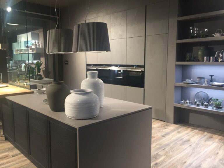
The Two-Tone Matte Finish Built for Visual Calm

This is how you do minimalism without making the room feel like a laboratory. By keeping the lower cabinets a crisp flat white and wrapping the massive, floor-to-ceiling pantry block in a moody, matte charcoal grey, the designer grounds the entire room.
What stands out to me here is the total lack of fussy hardware on the upper zones and the strategic pop of brushed brass on the exhaust covers. It’s strictly functional, relentlessly clean, and hides the chaos of a working kitchen behind flawless, flat-panel architecture.
The Seamless Sink That Eliminates Countertop Clutter

This close-up proves why the matte dark-grey and white combo works so well. But the real star here is the integration of the black composite sink directly into the dark countertop.
For years, we relied on chunky white farmhouse sinks that aggressively interrupted the counter line. By color-matching the sink to the surface, the work zone becomes a continuous, sleek shadow line. It’s a disciplined, stealthy approach to wet zones that feels incredibly expensive.
The Illuminated Backsplash That Acts as the Room’s Anchor

This setup is entirely unapologetic. Instead of a quiet, background backsplash, the designer used a heavily textured, illuminated glass or resin panel behind a massive, professional-grade range. It treats the cooking zone like a stage.
The heavy industrial hardware, the thick steel knobs, and the exposed metal railing reject the “hidden appliance” trend completely. This is a kitchen designed for someone who genuinely cooks and wants their space to feel like a high-end, working culinary workshop rather than a delicate showroom.
The Steel Prep Station That Replaces Fragile Tile

I am aggressively specifying stainless steel backsplashes this year. This is a brilliant evolution of the restaurant kitchen brought into a residential space. Instead of precious, hard-to-clean grout lines, the continuous steel sheet folds seamlessly into a built-in vent and an integrated storage niche.
Paired with flat-panel, natural wood base cabinets and ribbed glass uppers, it creates a perfect tension between cold, absolute utility and warm, organic casework.
The Solid Stone Statement Replacing Repetitive Patterns

If you are going to use a traditional, white paneled base cabinet, you have to create friction somewhere else—and this incredible, heavy-veined black stone backsplash is exactly how you do it.
We are moving away from repeating small tiles across a wall in favor of running one continuous, dramatic slab of stone right up to the hood. It turns the entire wall into a piece of natural art. Capped by a heavy, squared-off stainless exhaust hood, this kitchen is an exercise in high-contrast luxury.
The Ribbed Glass Upper That Hides the Mess

Open shelving is beautiful, but it demands constant organization. Solid uppers can feel heavy. This kitchen finds the perfect middle ground by using black-framed, ribbed (fluted) glass cabinets.
The texture allows light to pass through and creates a sense of depth, but it successfully blurs the shapes of the plates and glasses inside, hiding the visual clutter. Paired with ultra-sleek, taupe base cabinets featuring recessed, integrated pulls instead of protruding hardware, the layout is exceptionally tailored and modern.
The Furniture-Grade Shelving That Doubles as Architecture

This is my absolute favorite direction for kitchen storage right now. Instead of screwing wooden boxes to the wall, this design uses floor-to-ceiling, jewelry-grade brass and glass shelving systems that feel like luxury retail casework.
It turns everyday dishes into a curated display. Set against soft, grey-washed wood cabinetry with custom brass pulls, the kitchen feels less like a utility zone and more like an extension of the living room. It requires discipline to maintain, but the visual payoff is unmatched.
The Louvered Cabinet Door Breaking the Flat-Panel Rule

This space completely subverts the idea that kitchens have to be hard, cold, and strictly functional. The use of louvered (shutter-style) cabinet doors introduces incredible tactile shadow lines and a relaxed, almost resort-like atmosphere.
The designer brilliantly pushed the envelope by wrapping the backsplash in a soft, tropical-inspired pink and green wallpaper. Warmed up with rose-gold hardware and glowing under-cabinet lighting, it’s a deeply layered, highly personal space that rejects the sterile “resale” aesthetic completely.
The Hardworking Island With Open Access

Kitchen islands have historically been massive, solid blocks of cabinetry that eat up the center of the room. I love how this design breaks up that visual bulk by integrating open, wood-lined cubbies right into the face of the island.
It keeps everyday bowls and plates instantly accessible for the family without having to open a single door. Finished in a pale, muted sage green with a thick butcher-block top, it feels highly tactile, grounded, and designed around daily human habits rather than just hiding everything away.
The Sculptural Stool That Replaces the Flimsy Bar Chair

Kitchen islands have looked practically identical for a decade because we keep lining them with the exact same spindly, wire-frame barstools. This space completely upends that habit. By pairing a deeply tailored, illuminated island with heavy, organically carved wood stools, the seating becomes an architectural art installation.
It gives the room an incredible sense of gravity. I also love the unexpected industrial tension of the exposed red pipe overhead against the pristine, illuminated glass-front cabinets. It’s fearless, high-contrast design that refuses to be boring.
The Workbench Island That Opens Up the Floorplan

The massive, solid-block kitchen island is starting to feel incredibly heavy and overused. I am specifying these open, table-style prep islands more and more for 2026. It functions exactly like a traditional island, but the open base allows the eye to travel across the floor, making the room feel twice as large.
Paired with warm, unpainted wood cabinetry and functional chalkboard panels on the uppers, this kitchen feels like a working, high-end European bakery rather than a sterile, mass-produced suburban flip.
The Minimalist Hood That Replaces the Heavy Stainless Chimney

We are finally moving past the era of the giant, noisy stainless steel exhaust hood dominating the center of the kitchen. This ultra-slim, floating halo vent acts more like a piece of architectural lighting than a clunky appliance.
Set against two-tone, flat-panel cabinetry—a highly textured wood grain on the base and a matte taupe above—the entire layout feels horizontally expansive and visually calm. It proves that the hardest-working elements of a kitchen no longer have to be visually aggressive.
The Vertical Niche Reclaiming Dead Space

Storage right now is all about precision. Instead of slapping a useless filler panel at the end of a cabinet run, this design integrates a hyper-slim, floor-to-ceiling open shelving tower. It acts as a deliberate visual bookend for the kitchen.
I am also drawn to the aggressive layering of materials here: a stark white base, a rugged dark wood bar ledge, and a backsplash that transitions unapologetically from industrial concrete to a sharp geometric tile. It completely destroys the “safe” all-white rulebook and forces the room to have texture.
The Raw Brick Wall That Makes Subway Tile Look Timid

This is exactly what I mean when I say kitchens need architectural permanence. The designer skipped the standard decorative tile backsplash entirely, opting for a highly functional, low-profile strip of stainless steel to protect the immediate cooking zone, while leaving the rest of the wall as raw, exposed brick.
The friction between the hyper-modern, handleless matte grey base cabinets and the rugged, historic texture of the brick is incredible. It feels authentic, lived-in, and completely immune to fleeting micro-trends.