
Thinking about renovating your kitchen but not sure what actually needs to change? These kitchen renovation ideas focus on the structural decisions that immediately make older layouts feel outdated, not just new finishes or surface upgrades.

In 2026, kitchen design is moving away from crowded layouts, heavy cabinetry, and disconnected zones toward spaces that feel clear, open, and easy to use. Designers are reworking islands, simplifying cabinetry, improving light flow, and removing visual clutter to create kitchens that read as one cohesive volume instead of multiple competing elements.
Think larger islands that anchor the room, lighter materials that reflect space instead of absorbing it, vertical cabinetry that shifts proportions, and layouts that prioritize movement over storage density. Whether you’re planning a full renovation or a targeted update, these ideas show how small structural changes can completely transform how a kitchen looks and works.
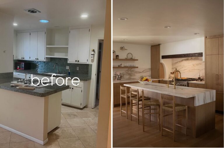
The Expanded Island Replacing the Tight, Boxed-In Kitchen

The layout originally worked like a series of obstacles. A small island, heavy appliances, and surrounding cabinetry forced movement into corners instead of guiding it through the space. Nothing acted as a true center.
By stretching the island into a longer, continuous surface, the kitchen gains a clear axis. Everything now orbits around it, prep, seating, circulation. The room stops feeling like a collection of pieces and starts reading as one organized system.
The Painted Cabinet Refresh Replacing the Flat White Kitchen

At first glance, the original kitchen looked clean, but the lack of contrast left it without depth. Surfaces blended together, and the space had no visual anchor.
The introduction of deep green cabinetry and a graphic floor immediately grounds the room. Instead of adding more elements, the update relies on contrast to define edges, giving the same layout a stronger presence and clearer identity.
The Soft Color Rebalance Replacing the Heavy Cream Kitchen

Cream cabinets paired with dark counters created a top-heavy composition that visually pressed the room downward. The palette broke the space into layers instead of allowing it to flow.
Shifting to muted tones and lighter surfaces removes those divisions. The kitchen now reads as a single volume, with the island acting as a quiet center rather than competing with the perimeter.
The Two-Tone Cabinet Upgrade Replacing the Heavy Oak Kitchen

The original kitchen treated every surface the same, continuous oak, continuous upper cabinets, no variation. That uniformity made the space feel dense and outdated.
Splitting the cabinetry into lighter uppers and warmer base units introduces hierarchy. The eye moves naturally through the space, and the added contrast reduces visual weight without removing storage.
The Open Shelf Upgrade Replacing the Cluttered Utility Wall

Previously, the kitchen operated like a storage wall. Appliances, shelves, and cabinets competed for attention, leaving no clear reading of the space.
Open shelving reorganizes that chaos by turning everyday items into part of the composition. Combined with warmer materials and a compact island, the kitchen shifts from storage-first to structure-first.
The Light-Filled Extension Replacing the Dark, Low Kitchen

The original ceiling did more than cover the room, it compressed it. Heavy beams and limited light kept everything visually low and inward.
Opening the roofline and introducing skylights changes the direction of the space. Light pulls the eye upward and outward, while the connection to the exterior extends the kitchen beyond its original boundaries.
The Sculptural Island Layout That Replaces the Cornered Kitchen

The previous layout relied on a peninsula that forced circulation around edges. Movement felt indirect, and the space lacked a clear focal point.
A central island simplifies everything. It creates a direct flow path and consolidates functions into one element. The result is less about adding space and more about removing unnecessary turns.
The Vertical Cabinet Redesign That Replaces the Dark Galley Kitchen

The original kitchen was dominated by dark wood cabinetry and a narrow galley layout that pulled everything inward, making the space feel longer, tighter, and visually heavy. Continuous upper cabinets and deep tones reduced light reflection, while the ceiling height remained underused.
The renovation shifts the entire perception by introducing lighter cabinetry, vertical extensions, and selective wood accents that draw the eye upward. By breaking the monotony with contrast and opening the visual weight, the same footprint reads wider, taller, and more structured without changing the layout itself.
The Simplified Cabinet Composition Replacing the Overbuilt Kitchen

Multiple materials, layered lighting, and a busy backsplash created a kitchen where nothing stood out because everything competed.
Reducing the palette to a few controlled elements allows each one to carry weight. The island defines the kitchen zone, while the surrounding surfaces support it instead of distracting from it.
The Bright Surface Overhaul Replacing the Dark, Segmented Kitchen

The original kitchen relied on dark cabinetry, heavy countertops, and tiled flooring that broke the space into smaller visual sections. The island felt bulky rather than central, and mixed finishes prevented the room from reading as a single, cohesive layout.
The renovation unifies everything through continuous light surfaces, clean cabinetry, and a larger island that anchors the space without adding weight. By removing contrast overload and aligning materials, the kitchen shifts from segmented to open, with light now defining the room instead of being absorbed by it.