
For a long time, the kitchen design formula was simple: pick a cabinet, pick a countertop, and then find a tile that matches. But as we move further into the year, I’m seeing that formula break down. The most exciting kitchens right now aren’t built on “matching”—they are built on materiality.

Instead of treating the countertop as just a work surface, designers are treating it as an architectural element that flows up the walls, wraps around islands, and even integrates functional tools directly into the stone. We are moving past the “safety” of white marble and simple slabs toward surfaces that feel raw, industrial, and deeply purposeful.
The ideas below are the directions I’m following this year. They move past the predictable “slab-on-cabinets” look and focus on how the surface defines the entire kitchen’s layout.
The “Monolithic” Stone Wrap

What I love here is the commitment to a single material. The stone doesn’t stop at the edge; it flows from the countertop straight onto the wall. It creates a seamless, moody environment that makes the kitchen feel more like a high-end gallery than a utility room. This is why I’m moving away from traditional breaks between surfaces—seamlessness feels more intentional.
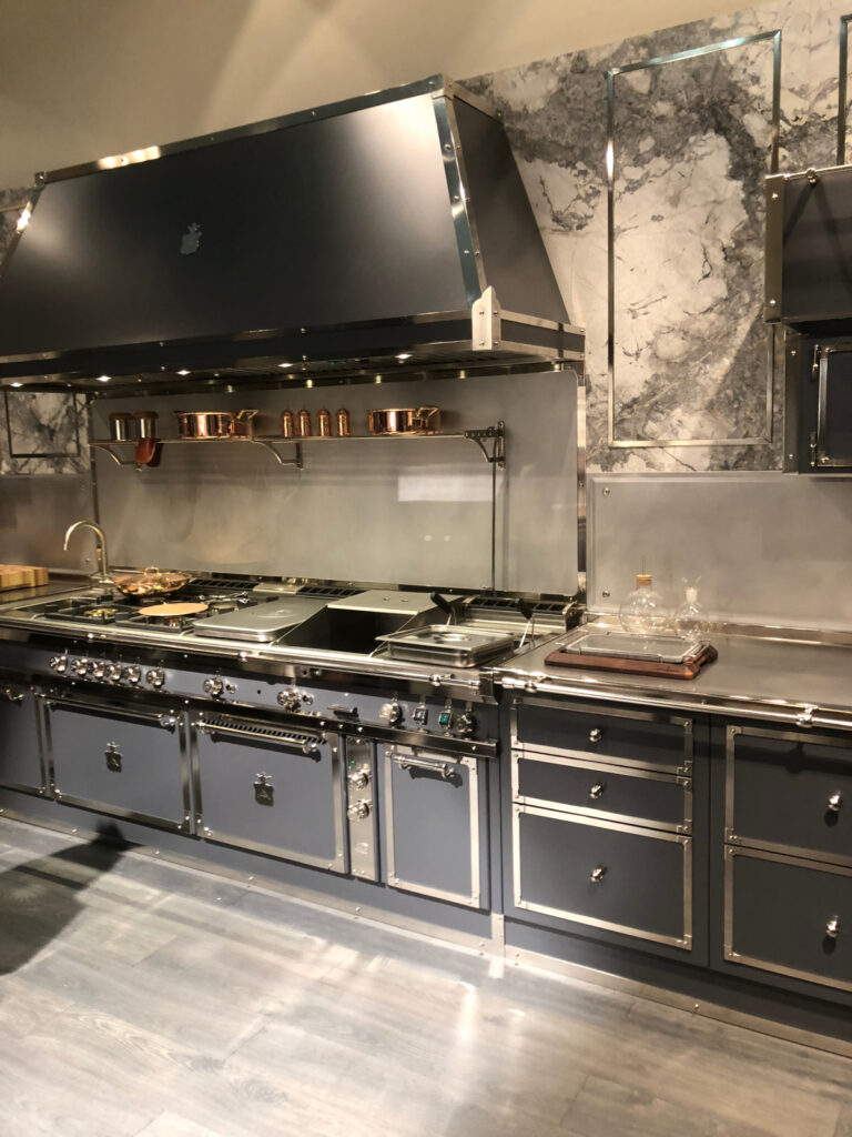
Industrial “Command Centers” in Stainless Steel

This is a perfect example of prioritizing function without losing style. The integrated metal surfaces and heavy-duty hood create a “chef’s kitchen” vibe that feels professional and permanent. Compared to standard stone, this feels far more architectural and durable for a kitchen that actually gets used.
Integrated “Tool” Sinks

I’m drawn to how the surface itself becomes a workspace. Instead of a separate cutting board and sink, the countertop is designed to hold functional inserts. It’s a reminder that a surface can be more than just a place to put things; it can be a tool in itself.
Metal Backsplash Panels for High-Heat Zones

This is a smart alternative to tile. Using a stainless steel panel behind the range is practical for cleaning, but visually, it adds a sleek, reflective contrast to the dark stone. It’s a “material-first” approach that makes the cooking zone feel defined and modern.
Floating Shelves that Blend into the Wall

I appreciate how the backsplash material continues up behind the open shelving. It makes the shelves feel like they are growing out of the wall rather than just being bolted on. It’s a cleaner, more tailored look that makes subway tile feel unnecessary.
The “Furniture-Style” Integrated Table

This proves that your kitchen island doesn’t have to be a solid block. By layering a raw wood “dining” surface over a metallic base, the kitchen feels more like a living space. It breaks up the “lab-like” feel of many modern kitchens.
Warm Wood Textures as a Vertical Anchor

I’m paying a lot of attention to how wood is being used vertically this year. Instead of a backsplash, using full-height wood panels brings an organic warmth that balances out cold, dark countertops. It feels “lived-in” but still very sharp.
Mirrored Geometry for Depth

This is a bold move that replaces the standard backsplash with mirrored panels. It doubles the light and makes the room feel twice as large. It’s a “statement” surface that turns the kitchen into a high-design social space.
Concealed Storage Behind Stone Sliders

I love the “magic” of this—the backsplash is actually a sliding stone panel that hides your clutter. It keeps the kitchen looking perfectly clean while keeping tools within reach. This is the kind of “smart architecture” that is replacing simple tile.
Sculptural Hoods as the Focal Point

Finally, I’m seeing the “backsplash zone” being dominated by the vent hood itself. A matte black, sculptural hood against a neutral stone wall creates a “visual anchor” that doesn’t need a busy tile pattern to look interesting. It’s about being bold with big shapes instead of small details.