

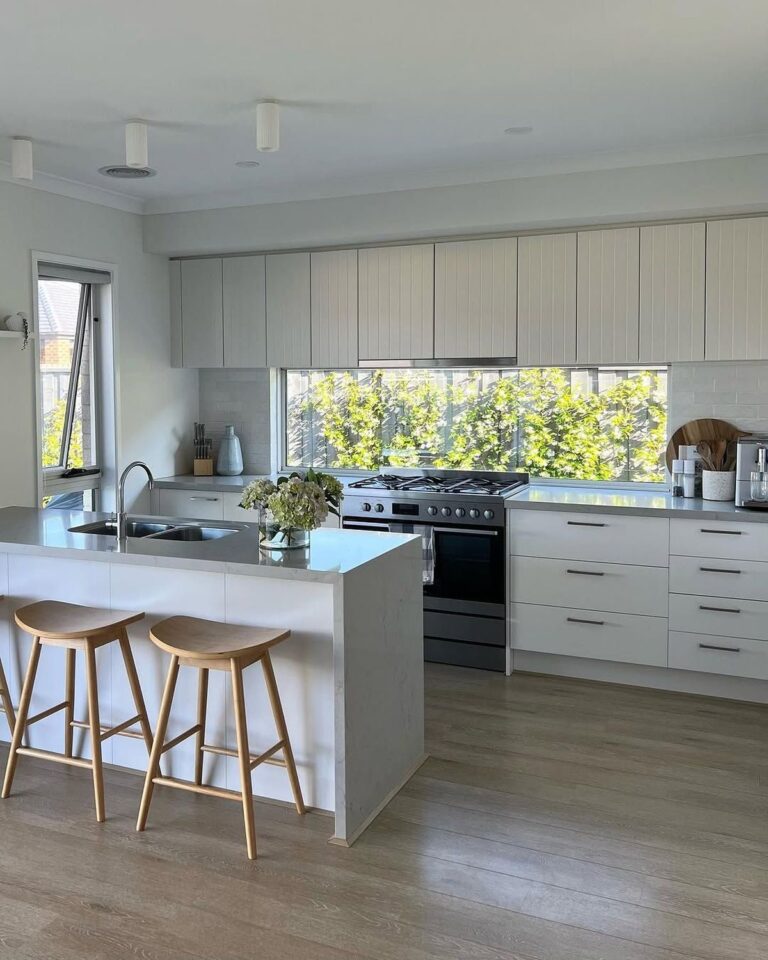

Kitchen backsplashes in 2026 are starting to disappear behind the counter. Instead of tile, stone, or slab walls, homeowners are replacing the entire backsplash zone with windows that bring natural light directly into the workspace.

That one move changes how the kitchen feels immediately. Counters no longer stop at a solid surface, upper cabinets shift higher or break apart, and the wall behind the sink starts acting more like an opening than a finish. The result feels lighter, cleaner, and less boxed in without adding square footage.
Some kitchens use full-width glass stretching across the entire counter. Others rely on narrow slot windows, black-framed openings, corner glass, or frosted panels that protect privacy while still pulling in daylight. In every version, the same update is happening. The backsplash stops acting like decoration and starts becoming part of the architecture.
Full-Length Garden Window Replaces Upper Cabinets as the Visual Focus

The entire wall behind the cooktop becomes a continuous horizontal window, shifting attention away from cabinetry and toward the exterior. Upper cabinets are still present, but they step back visually, allowing the green view to define the space. The backsplash is no longer a surface. It becomes depth, light, and movement.
This layout changes how the kitchen feels during use. Cooking happens against natural light instead of a solid wall, which reduces visual weight and opens the working zone. The result is not just brighter, but structurally lighter, with the room extending outward rather than stopping at tile.
Slim Slot Window Keeps Privacy While Opening the Wall

A narrow horizontal window runs just above the counter line, letting light in while keeping most of the wall intact. This works in tighter or suburban settings where full exposure is not ideal. The backsplash becomes a controlled opening rather than a full reveal.
The advantage sits in balance. Storage remains uninterrupted above and below, while the slot introduces daylight exactly where it is needed. It avoids the heavy look of a full wall while keeping the kitchen functional and enclosed.
Black-Framed Window Creates a Defined Contrast Line

The dark frame cuts across the otherwise light kitchen, turning the window into a clear architectural line. Instead of blending in, the opening is outlined and becomes part of the composition. Plants outside act as a layered backdrop rather than a distant view.
The contrast adds structure without adding objects. It replaces patterned backsplashes with a single, controlled visual break that anchors the wall.
Window and Open Shelving Share the Same Horizontal Zone

The window aligns with adjacent shelving, creating a continuous band that runs across the wall. Storage and light occupy the same level, which keeps the layout consistent instead of fragmented. The backsplash becomes part window, part display.
This shifts how objects are placed in the kitchen. Items on shelves sit within the same visual line as the exterior view, making everything feel connected. The wall reads as one system rather than separate elements.
Extended Counter Window Pulls the Outside Into the Workspace

The window stretches across the entire prep zone, sitting low and wide behind the counter. Instead of a vertical opening, it becomes a horizontal extension of the work surface. The greenery outside reads almost like a living backsplash.
This layout changes the sense of depth. The counter no longer ends at the wall, which makes the kitchen feel larger without increasing square footage. It is a spatial trick that replaces materials with distance.
Brick Wall and Window Combination Replaces Traditional Tile

The exposed brick provides texture, while the window cuts through it to bring in light. Instead of choosing between a solid backsplash or an opening, the design uses both. The materials stay tactile, but the wall does not feel closed.
This approach works in kitchens that need character without losing brightness. The brick anchors the space, while the window prevents it from becoming too heavy. The balance keeps the room grounded but open.
Continuous Cabinet Line Floats Above the Window Strip

Upper cabinets run uninterrupted, but they are lifted slightly to allow a window strip underneath. This creates a floating effect where storage appears detached from the counter. The backsplash disappears into a band of light.
The benefit is efficiency without bulk. Storage stays intact, yet the wall feels lighter because it is visually split. The gap between counter and cabinets becomes functional rather than decorative.
Minimal Frame Window Keeps the Wall Clean and Silent

The window frame is reduced to almost nothing, allowing the view to sit flush with the wall. There are no heavy borders or trims, so the opening reads as part of the surface rather than an inserted element.
This works in kitchens that rely on clean lines. The absence of visual interruption keeps the composition calm, while the window still delivers light and depth. It replaces decorative backsplash patterns with restraint.
Island Alignment Mirrors the Window for a Centered Layout

The island sits directly in line with the window, creating a strong central axis through the kitchen. Seating, sink, and view all align, which organizes the space without adding partitions. The window becomes part of the layout, not just a feature.
This creates a sense of order that standard backsplash designs do not provide. The room is structured around alignment instead of surfaces, making movement and use feel more intuitive.
Two-Tone Cabinetry Frames the Window Instead of Covering It

Dark lower cabinets and light upper cabinets frame the window strip, giving it a clear position within the composition. The contrast defines the opening while keeping the rest of the kitchen balanced.
This replaces the need for bold backsplash materials. Color does the work instead, and the window sits between the two tones as a natural divider. The result feels structured without extra layers.
Frosted Glass Window Maintains Light Without the View

The window brings in daylight but blocks direct visibility, making it suitable for close neighbors or street-facing kitchens. The backsplash becomes a soft light source instead of a visual opening.
This idea keeps the benefits of a window while solving privacy concerns. It replaces solid walls with diffused brightness, which improves the feel of the space without exposing it.
Full Wall Window Works as a Continuous Backdrop

The window spans nearly the entire width of the kitchen, acting as a constant background behind all work zones. Cabinets and appliances sit in front of it rather than breaking it up.
This creates a consistent visual field across the room. Instead of multiple materials competing, the exterior view becomes the only backdrop. The kitchen reads as one continuous space.
Long Narrow Window Paired With Vertical Cabinet Lines

The horizontal window contrasts with vertical cabinet paneling, creating a grid of directions. The backsplash becomes the intersection between these lines rather than a separate surface.
This adds structure without decoration. The geometry replaces patterns, and the window becomes part of that system instead of an isolated feature.
Decorative Glass Panel Turns the Window Into a Feature Surface

The glass behind the cooktop includes texture or pattern, turning the window into a designed element rather than a clear opening. Light still enters, but the surface also reflects and diffuses it.
It keeps the functional benefit of light while introducing a controlled visual layer, replacing tiles with a single integrated feature.
Dark Stone Island With Slot Window That Keeps the Wall Controlled

The window runs as a narrow horizontal strip behind the cooktop, set between the counter and upper cabinets. It does not open the entire wall, but it removes just enough surface to bring in light without exposing the kitchen fully. The dark countertop and wood cabinetry stay dominant, while the window works as a secondary layer.
This setup keeps the kitchen grounded. Heavy materials like stone and wood define the space, and the window acts as a controlled break rather than a full opening. It suits layouts where storage and privacy matter, but the wall still needs to avoid feeling closed.