

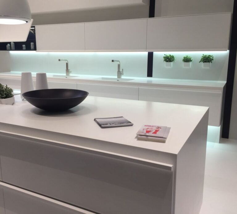


White and gray aren’t disappearing from kitchens, but I’m seeing far more interesting color choices heading into 2027. Instead of cool neutrals or one bright accent cabinet, these kitchens use colors that look softened, earthy, or pulled from older interiors.

Muted mauve sits beside wood ceilings and patterned tile. Mustard yellow surrounds a farmhouse sink. Burgundy covers entire cabinet walls. Greens have shifted from obvious sage toward celery and muddier botanical shades, while brown is becoming dark enough to replace black.
What connects these kitchens isn’t one color. It’s the willingness to let cabinetry carry enough color to define the room, often with stone, brass, wood, plaster, and other materials that keep the palette grounded.
Muted Mauve

Dusty mauve covers the cabinetry while a related brown-pink tone continues across the wall. Instead of separating cabinets from the room with contrast, both surfaces sit within the same muted palette.
Wood ceiling beams, aged brass, copper pans, marble, and patterned tile keep the pink from reading as sweet. This is the kind of color I’m watching because it behaves almost like a neutral once surrounded by natural materials.
Mustard Yellow

Mustard brings much more warmth than the pale creams that have dominated neutral kitchens. Here it covers the sink cabinetry and continues around the room, with sunlight making the yellow stronger without pushing it toward a bright primary shade.
Brown on the island, brass at the sink, warm wood flooring, and the tan window shade reinforce that warmth. White still appears on the counters and backsplash, but it no longer determines the palette.
Deep Plum

Plum gives the island enough depth to anchor a kitchen filled with white cabinetry and pale stone. Its red undertone makes it warmer than navy, while the dark value gives it some of the same visual weight.
Exposed timber overhead changes the effect again. Against aged wood, brass, and stone flooring, plum feels less like an accent color and more connected to the materials around it.
Earthy Pink

Pink becomes much easier to use across cabinetry when brown and clay undertones replace the candy-like versions of the color. This kitchen carries the shade from the lower cabinets onto the walls and window trim, creating one continuous envelope around the white counter.
Brass at the faucet adds warmth without introducing another dominant color. Black hardware on the cabinets keeps the pink from becoming too delicate.
Organic Green

Green kitchens aren’t new, but I’m paying more attention to versions that look pulled from plants, herbs, and weathered landscapes rather than clean paint-chart greens.
Here, green covers cabinets, the island, tall storage, and the hood surround. Brass hardware and off-white stone interrupt the color, while the subdued tone allows such a large amount of green to work without dominating every surface.
Faded Pastels

Pastel blue takes on a different character when paired with exposed timber, brass, stone flooring, and a small floral window treatment. Nothing has the crisp contrast associated with many blue-and-white kitchens.
That faded quality is what interests me for 2027. Pastels don’t need to look juvenile or coastal when the color has enough gray and the surrounding materials bring age and texture.
Celery Green

Celery moves green in a lighter, yellower direction. Compared with deeper sage and olive cabinetry, it reflects more light and has less visual weight, which makes it useful across a large island.
Brass cup pulls reinforce its warm undertone, while wood surfaces prevent the pale green from feeling washed out. It’s a softer way to bring color into a kitchen without returning to white.
Burgundy

Burgundy is one of the strongest shifts in this group. Cabinets, island panels, and tall storage use the same dark red-brown family, creating the depth people often seek from black cabinetry without the same starkness.
Veined stone and brick flooring bring lighter surfaces into the room, while wood furniture sits comfortably against the red undertones. Burgundy works here because the kitchen commits to it rather than limiting the color to one small section.
Cottage Blue

Soft blue cabinetry has been around for years, but this version feels different from the blue-gray kitchens that became common during the gray interior era. More color comes through, while wood ceilings, butcher-block counters, brass hardware, and patterned fabric keep it warm.
That combination matters. Blue isn’t being used to make the kitchen feel cooler or sharper; it sits alongside materials that make the room feel collected.
Chocolate Brown

Chocolate brown may be the clearest departure from the white-and-gray kitchen cycle. Dark cabinetry covers almost an entire wall and continues onto the island, but its red-brown undertone creates warmth that black cabinetry wouldn’t provide.
Black stone, veined white stone, brass hardware, and natural wood stools show how much range brown has around other materials. Instead of acting as a secondary wood tone, brown becomes the kitchen’s dominant color.
Heading into 2027, I’m watching the undertones more than any single kitchen color. Greens are getting muddier, pinks browner, blues softer, and dark cabinetry warmer. Even mustard and burgundy feel connected because neither relies on a clean, bright hue.
White and gray can still provide the counter, stone, or backsplash, but they don’t have to control the room. Which of these colors could convince you to move away from a white or gray kitchen?